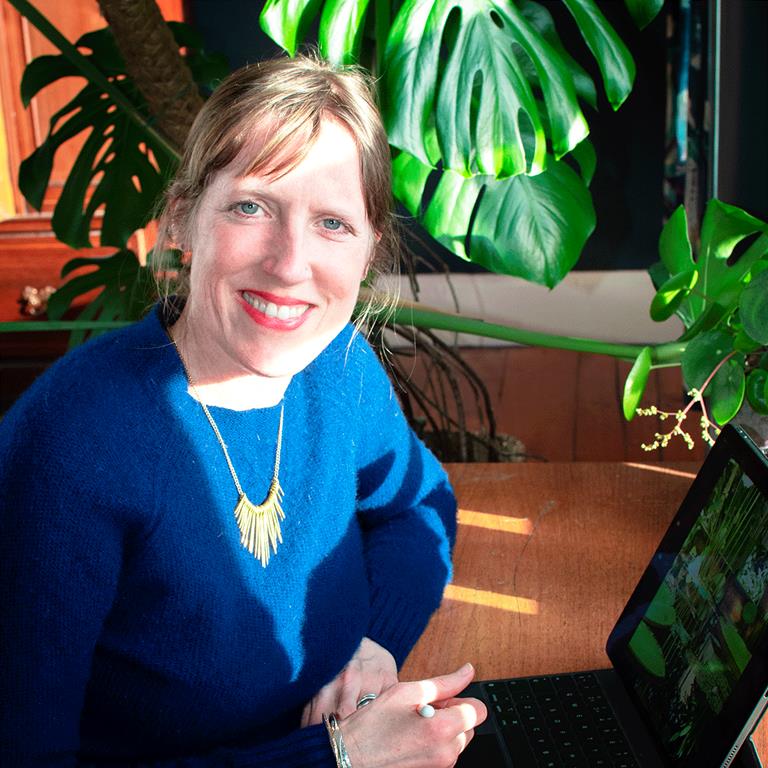
Meet the Maker: Rosie Reiter
Posted on 17th March 2022
I’m a Chelsea trained artist, art teacher and mother of two small people, living in the gorgeously creative city of Bristol. After years of helping others express their creativity, I’m really excited to be finally fulfilling my dream to create my own beautiful artwork in the form of art prints, greeting cards and murals. I aim to bring colour and beauty into your home.
Tell us a little about your business – what is it you make?
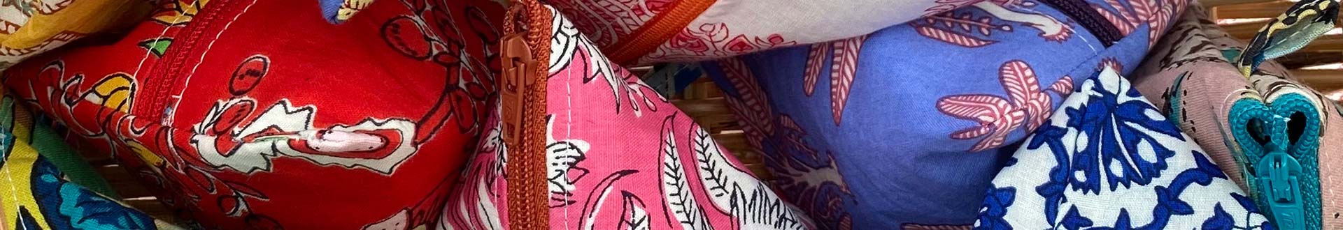
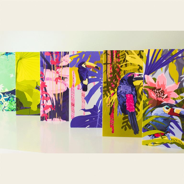
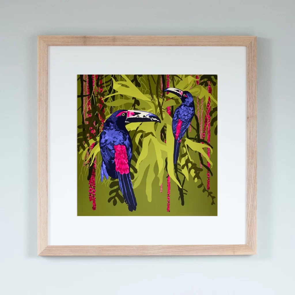
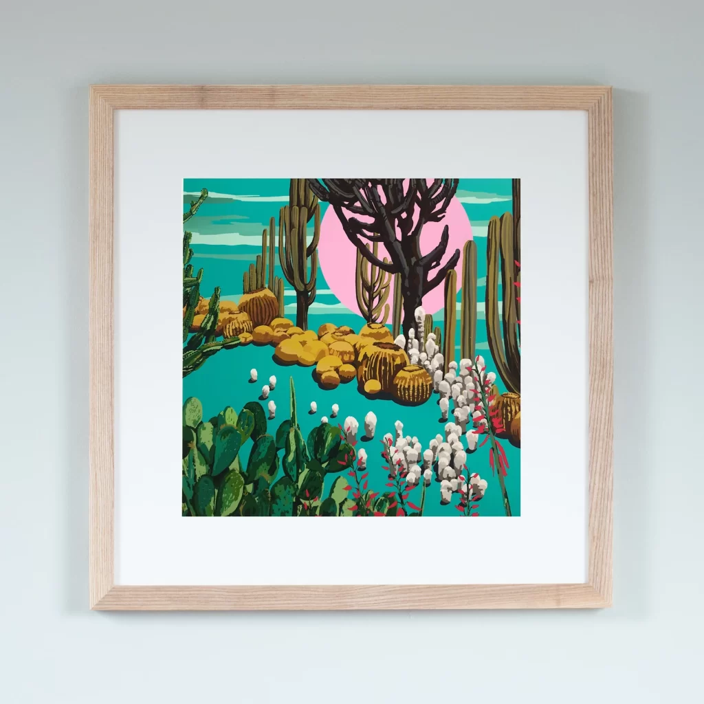
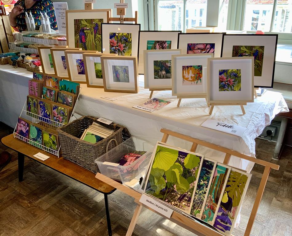
My sustainable art prints, greeting cards and bespoke murals come in a range of sumptuous designs inspired by the vibrant colours of the jungle and arid landscapes of the desert, and are made up of exotic plants, tropical flowers, cacti and jewel like birds, showcasing my passion for bold contrasting colours, shapes and textures.
How did you get started in your creative field?
I moved up to London in my twenties to do a Public Art: Mural Design degree at Chelsea School of Art and stayed for 22 years. After my degree, I began my art career in the art departments of TV and film, working on productions including Batman Begins, Harry Potter and James Bond.
After five years I decided I needed a more stable career so I trained to be an Art teacher. I taught Art and Design in two London schools for over ten years.
When I moved to Bristol six years ago, I took a career break to have a family. In between having my children I worked freelance for Boomsatsuma as an Artist in Residence based in local primary schools. During the first lockdown I decided I wanted to facilitate my own creativity and see if there was a market for it, and launched my new design business in June 2021 – I’ve had an amazing start so far.
Talk us through your creative process…
I visit botanic gardens and natural spaces in order to take primary source photos, and my house is full of tropical plants which I frequently use as reference. I either work directly from these or collage different images and photos together in order to create a design.
Colour is key for me, and I love the colours to pop and be harmonious. I design straight on my IPad in Procreate and work in layers. I always start by working up different tones of each hue once I have my initial palette finalised so it gives the image depth.
I really like to work with limited colour palettes but this means being strict with yourself. The main feature is what I focus on first, mostly birds, then I work the background up next. Often when I begin to design the whole process is experimental, and happens over a number of weeks, I don’t know what I will end up with. I like the uncertainty of that process and not knowing where it will take you, and the excitement you feel when you have hit upon something that works.
What sort of space do you work in?
I have a work space set up in our loft, but I frequently move all round the house in search of the warmest, and most peaceful space with the best natural light.
What are the values behind your business?
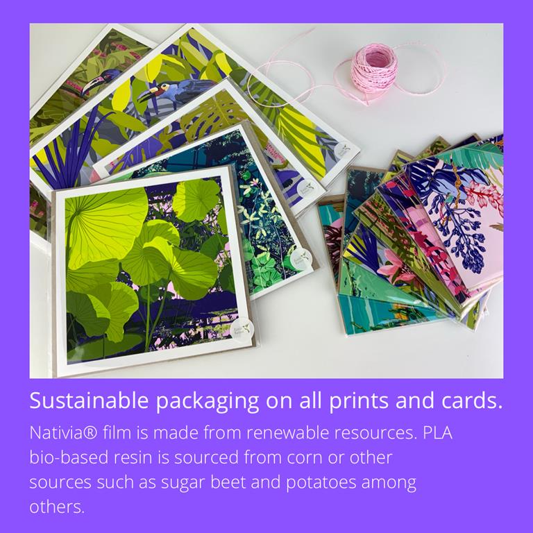
Sustainability, high quality and originality are my core values. I perceive the natural world as the source of my creative inspiration, so treading as lightly as possible in our environment is an important and fundamental pillar of my business.
My greeting cards are on 300gsm FSC certified recycled card stock, sold naked as standard and supplied with an Eco Kraft envelope. I use biodegradable and compostable packaging, local independent printers and ethical suppliers for my products.
I aim to create high quality art prints that are made to last using high quality Giclee printing on Smooth Fine Art 320gsm paper.
Where do you find creative inspiration?
I travelled extensively through my twenties and thirties, and have been hugely inspired by the desert and jungle landscapes of South, Central and North America as well as Asia and Australia. I fell in love with the bright colours of the art and textiles in the markets, and on architecture, as well as the natural landscapes. Colour for me is everything.
I am really inspired by the work of Timorous Beasties and Emma J. Shipley, both designers of soft furnishings, wallpaper and accessories. I really admire their attention to detail, colour combinations and sumptuous imagery. I also love Kitty McCall’s use of bold pattern, large print and popping colour. I use magazines and paint charts for colour inspiration and subscribe to Elle Decoration.
Are there themes that run through your work?
Tropical and desert landscapes, birds, and pops of colour.
What do you love most about making?
The creative process, getting lost in it, it’s something that is hard to describe, it feeds your soul. And then there is something beautiful at the end of it.
Which piece of work are you most proud of?
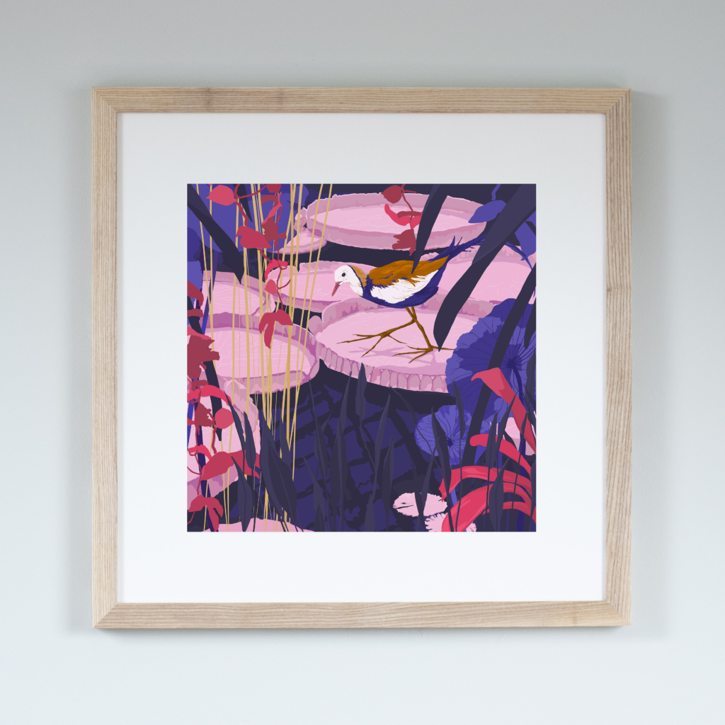
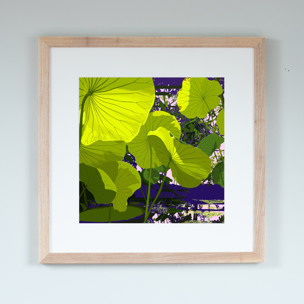
It would have to be Sunlight Through Lotus, which is kind of ironic really given that it was one of the designs that I struggled with most and nearly ditched half way through. It was based on a photo that I took in the University of Bristol Botanic Garden, I love the quality of light in it and was really pleased to be able to capture it. This is now also available as a greeting card as well as print.
Describe your work in three words…
Vibrant, unique, colourFULL
Click here to visit Rosie’s shop